


It used to be — “in the good old days,” when people still used to “write by hand” — that handwriting analysts could tell a lot about a person’s personality by his or her handwriting. Some still ply their analysis craft, if and when such a “specimen” is available.
Juliana LaBianca and Brittany Gibson in “Here’s What Your Handwriting Says About You,” claim, “The way you dot your “i’s” and cross your “t’s’” could reveal more than 5,000 different personality traits.”
For example, according to handwriting analysis experts cited by the authors:
If you dot your “i’s” high on the page, you likely have an active imagination…A closely dotted “i” is the mark of an organized and detail-oriented mind. If you dot your “i’s” to the left, you might be a procrastinator. And if you dot your “i’s” with a circle, you likely have playful and childlike qualities.
Other “telling indicators”:
• Are your o’s open or closed?
• How do you write your e’s?
• Which way does your handwriting slant?
• How much do you space your words?
Some among us who still use or remember using good, old-fashioned penmanship may recognize one or more of these characteristics in their handwriting.
My signature is an immediate giveaway. I must be a “private or hard-to-read person,” as my signature is virtually ineligible. On the other hand, if you have a legible signature, that is a sign of “confidence and comfort in your own skin.”
Now that most of us have “progressed” from handwriting to hitting the computer keyboard, it would be nice if there were experts to analyze our personalities according to the font we choose to use.
And, voilà, there is a whole new crop of experts who can associate your favorite font with your personality.
In “What Your Favorite Font Says About You,” we learn exactly that.
In an analysis of fonts, Raka Sen interprets what the use of each of 15 fonts says about the users’ personalities.
Here are some highlights:
• “Times New Roman (TNR) just screams traditional, and chances are that TNR-lovers are afraid of change…”
• “Helvetica says that you are artsy and interested in design. Even if it’s not true, Helvetica gives off the impression that you’ve got your life together…”
• “Rock on if you use Rockwell. This underrated font is classy with the perfect amount of edge. Rockwell users wear a suit during the day and leather pants at night…”
• “Franklin Gothic is the vanilla ice cream of fonts. It’s a classic. You’re probably a rich banker if you use this font, or maybe you’re just good at Monopoly…”
• If you use Bradley, “[y]ou hate your roommates, but you’re too scared to tell them. Bradley Hand is the way you make your passive aggressive notes seem less angry. If you’re using Bradley Hand, you might want to see a therapist to deal with your issues. Or just change fonts.”
My favorite, old-standby, boring font is Georgia. Sen does not include this font in the analysis. Another expert just says “Practical.”
We’ll leave it at that.
Today, technology allows us to revive the ancient art of handwriting by using one of the hundreds of “handwriting,” “cursive” or “script” fonts now freely (and free) available on the web, ranging from the traditional family of Lucida handwriting fonts to a newer generation that includes the “elegant” Halo Handletter, the “beautiful” Serendipity and the “full of character and flair” Flenella.
For those who want to retain that retro, fifth grade look and feel, there is – what else? — the 5th Grade Cursive, designed by Lee Batchelor “during Christmas break in college out of a need for a font that faithfully reproduced the cursive [he] learned in elementary school.”
And for those who still use Comic Sans, Raka Sen has this advice: “If you use Comic Sans, now is the time to never use Comic Sans again. The joke of the font world, Comic Sans is silly, stupid, and makes you look completely unprofessional..”
The author’s wife, a hummingbird lover, would like the new Hummingbird script, “a sensual and very sophisticated cursive font style with a very interesting swooshes looping at most of each letter forms.”
But what does all this have to do with Joe Biden and the “Biden font,” you may rightfully ask.
Well, since I have already exceeded the “optimal” blog post length, I will keep it short.
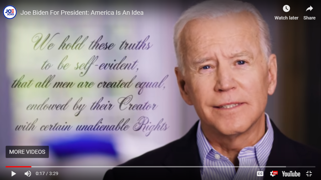
Last Thursday, Joe Biden announced his 2020 presidential candidacy with a dramatic video where he discusses “the great values of our nation” and where, at the beginning, Biden quotes the Declaration of Independence. The quoted lines also appear in cursive font on the video (lead image).
Kenzie Bryant, in a satire piece at Vanity Fair, describes the font in the video as “the font of a Hallmark condolence card… the font of a budget wedding invite… the font of cheese.”
Sarcastic and unflattering as this may sound, Bryant apparently means no harm as the lead to her story reads “When he announced his campaign Thursday, Biden made a few subtle nods to the realforgotten Americans: people still struggling with their iPhone keyboards..”
Bryant concludes — referring to the announcement-accompanying tweet — “Good thing nobody cares about how good a candidate is at the Internet. Remember, the guy who repeated ‘cyber’ on the campaign trail like a malfunctioning sex robot is in the White House.”
Since we are discussing handwriting analysis, perhaps someone should analyze Trump’s signature.
But wait, it has already been done (“about 9,480,000″ Google search results), and “it ain’t pretty.”