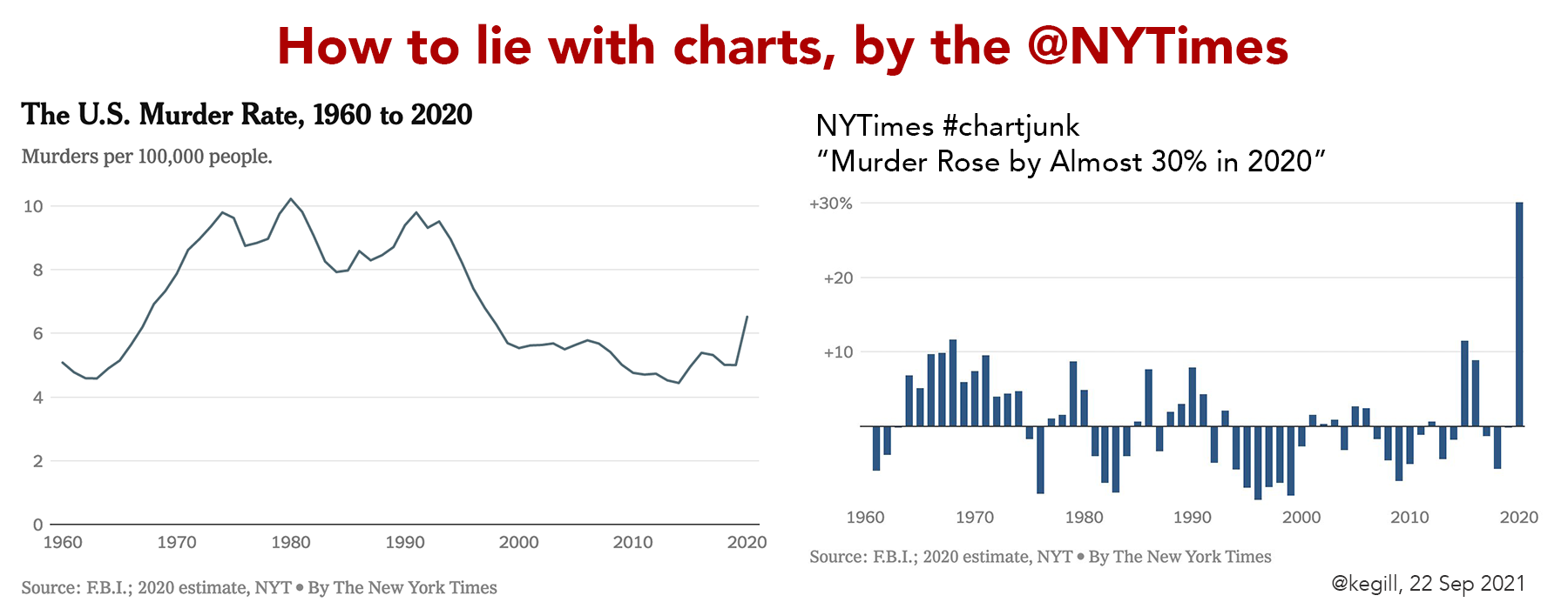
I saw the headline in Memeorandum, but skipped the click because I anticipated fearmongering. Never in my wildest dreams could I have anticipated that bar chart on the right. It came my way via Twitter.
How bad is this? Let’s count the ways.
1. Data not normalized
2. Not the appropriate visualization
3. No differentiation between data and projections
4. Not the whole story
5. No contextualization of risk
And NOT a NYTimes staffer; that should be clear in byline, not just in small print at the bottom.
Known for gnawing at complex questions like a terrier with a bone. Digital evangelist, writer, teacher. Transplanted Southerner; teach newbies to ride motorcycles. @kegill (Twitter and Mastodon.social); wiredpen.com


