In a comment to a recent piece on immigration, a reader expressed admiration for one of Visual Capitalist’s visualizations of two centuries of immigration to the U.S.
And indeed, the illustrations and animations are imaginative, impressive and very informative.
Illustrating two centuries of human activity is challenging enough. But how does one capture a journey that began some 14 billion years ago in one graphic?
Leave it to “the world’s best data storytellers” at Visual Capitalist to do so.
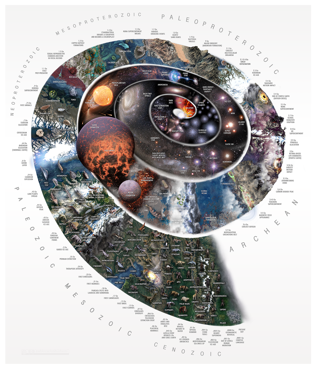
One of those story tellers, Pablo Carlos Buddassi, has been able to illustrate earth’s journey from the Big Bang to life as we now know it in one amazing graphic, above.
(To view a larger version of the graphic, please click HERE.)
As the accompanying article explains, Buddassi’s visualization “illustrates this journey of epic proportions in the intricately designed Nature Timespiral, depicting the various eras that the Earth has gone through since the inception of the universe itself.”
The spiral starts with the Big Bang and subsequent “Hadean Eon” (when our universe was formed), and takes us through the Archean Eon (when the first signs of life appeared on earth – a mere 3.5 billion years ago) and spirals out into the Cenozoic Era (66 million years ago – Present Day) when, at the very edge of it, Homo sapiens appears, the beginning of human history, “compared to everything that came before it…but a brief blink of an eye.”
The diversity of Visual Capitalist’s infographics, visualizations, data sets, interactive maps and charts, etc., is amazing.
Here is a small sampling:
• Interactive: Natural Disasters Around the World Since 1900
• Visualizing Literacy Rates Around the World
• Visualizing the Distribution of Household Wealth, By Country
• Visualizing the World’s Loss of Forests Since the Ice-Age
• Mapped: The Top Export in Every Country
• The Most Significant Cyber Attacks from 2006-2020, by Country
• The 50 Most Visited Websites in the World
• Visualizing All of Earth’s Satellites: Who Owns Our Orbit?
• Visualizing the History of Pandemics
• Animation: The World’s Rapid Rise in Life Expectancy, in Just 13 Seconds
• Mapping the World’s Youngest and Oldest Countries
• Mapped: Economic Freedom Around the World
• Mapped: Corruption in Countries Around the World
Just in the last week or so, there were stories on:
• The World’s Largest Economies, Sized by GDP (1970-2020)
• Visualizing Companies With the Most Patents Granted in 2021
• What Are the Most Produced Cash Crops in Africa?
And – as distinct as one can get from the creation of our universe – one on “Beer Consumption in the U,S.”
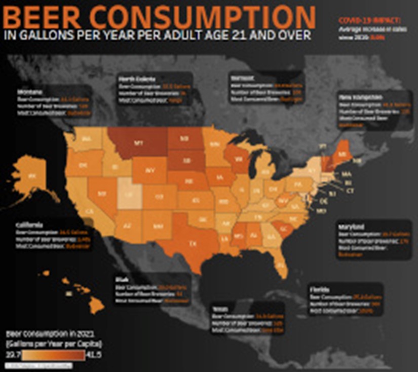
The interactive map (“static” copy below) developed by Victor Dépré says pretty much all that one may want to know about consumption of one of America’s most favorite drinks.

Click on the map HERE it see how much beer is consumed annually, per capita, in your state.
New Hampshire took the top spot in 2020, outdrinking other states with 41.5 gallons of beer consumed annually per capita. In contrast, the lowest consuming state was Maryland which only consumed 19.7 gallons per capita…
Also, click on it to see what the most popular beer in each state is.
Despite the growing trend of craft breweries in some states, the most popular beer across the country was Budweiser of Anheuser-Busch, which took the top spot in 23 states.
Finally, learn how many breweries your state has.
California has the highest number of breweries in the country, more than double any other state, at 1,466.
On the flip side, Mississippi has the fewest breweries, with the most recent Beer Institute’s 2021 almanac only listing 26 in the entire state.
The article concludes with an interesting snapshot of how COVID-19 has affected beer sales in the U.S.
To learn more about our universe or your beer, and everything in between, please go to Visual Capitalist.


